Here is our place to come together as a class to post your projects and to comment on each other's work. In addition to the project work, each week you will post a short review of the work of a graphic designer found from the list of 68 Graphic Designers posted in week 1 on the syllabus. Two posts are expected from each student... project work and review work. Each counts as one attendance.
Monday, October 31, 2011
Week One - Saul Bass


Erik Nitsche was born in Lausanne, Switzerland on September 7, 1908. Nitsche Migrated to the United State at the age of 26 and embarked a successful career as a graphic designer and an art director. He’s known for his detailed look of page composition, detail clear design, colors typography, and catered geometrical foundation. He work for General Dynamics and composed their cooperate image and produce signature distinction of hydraulic systems and cross-section of airplane. Nitsche is well known for his productions of children’s book post the nineteenth sixties. He was the master of elegance of simple type presentation, and the juxtaposition of elements on a page. He’s definitely a legend in my eyes whenever graphic designers are mentioned.
http://en.wikipedia.org/wiki/Erik_Nitsche
Susan Kare - Week 2
 Susan Kare, born in 1954, is an artist and graphic designer who created many of the interface elements for the Apple Macintosh in the 1980s. After receiving a Doctorate in Fine Arts from New York University in 1978, she moved to the San Francisco area to first work briefly as an Assistant Curator at the Fine Arts Museums of San Francisco, then as a Freelance Graphic Artist. Her career in user interface graphic design began when she worked for Apple Computer between 1983 and 1986. With the introduction of the Macintosh in 1984, Apple pushed the world toward the graphic interface, which provides greater ease of use. A graphic interface allows an operator to control the computer by manipulating symbols displayed on its monitor, usually with a mouse or trackball.
Kare left with Steve Jobs to become Creative Director at NeXT Inc. After two years there, she began to freelance for companies such as Microsoft. She did many of the icons for windows 3.0, which was Microsoft's first successful attempt to reproduce a Macintosh-like experience on IBM-compatible personal computers. In 1989, she was a founding partner of Susan Kare LLP.
During the past years, she has drawn more than 2,000 icons for computers, coming up with dozens of symbols representing the commands ‘print’, ‘merge’ and ‘quit’. Her clients have included the leaders of the computer age: Apple, The Getty Technology Group, Intel, IBM, Sony Pictures, Yahoo, AT&T, Motorola Autodesk, Eazel Inc. and Microsoft.
She is a 2001 recipient of the Chrysler Design Award and currently heads a digital design practices in San Francisco and sells signed prints at kareprints.com.

Storm Thorgerson


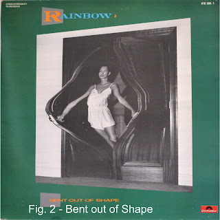
known for his infamous album covers for various bands. He is also known for his design studio called StormStudies, which consisted of freelancers. His most famous album cover would be for the rock group Pink Floyd titled “The Dark Side of the Moon” and many more. Thorgerson works closely with objects and
making them look real without placing them in their traditional form. Several books have been written dissecting three decades of Thorgerson work.
Sunday, October 30, 2011
Philip B. Meggs

He has been called the most important historian of design since Nikolaus Pevsner (1902-1983). He was one of the first educators to create an overview of the history of graphic design and did not depend exclusively on the traditional structure of the history of the art.
After college, he worker as a senior designer at Reynolds Metals and then art director at A.H. Robins Pharmaceuticals. In 1968, he began teaching in the Communication Arts and Design Department at Virgina Commonwealth University, chairing the department from 1974 to 1987. In addition to teaching he served as visiting faculty at Syracuse University and the Nation College of Art and Design, Dublin. Inspired by the lack of research and instructive design materials on the history, theory and creative methods, that's when he decided to teach about the history of graphic design. Leading him to write his first book, A History of Graphic Design.
Friday, October 28, 2011
Week 1 - Letterform


William Calson was born on January 23, 1692 in Cradley, Worcestershire London England. He was a well known gun smith and a typeface/foundry(type foundry is a company that design/an distribute typefaces designer). Typeface was introduced to Calson and encouraged by William Bowyer. He was also highly influenced by some of the great printers before him such as John Baskerville , Bulmer, Bell, Bodondi, Didot, and Fairfield. These were the major progenitor who inspired him and shaped much of Carlson’s work. Vastly influenced by his progenitors, Calson became dedicated to his craft and went on to developed and cultivate his own business(Calson Foundry) in England and became one of the leading printers(of 18th and early 19th century) of the day and on the continent. Carlson was popularized and for known for the first printed version of the declaration of independence. He’s also recognized for the slogan “ when in doubt use Calson.”
Scallop for Stamp Project
Thursday, October 27, 2011
Letterform - Week 1


Below are four letter forms that were created in Photoshop CS4. Struggled a bit since the first video did not work. Once I figured out how to do the layers, I then watched the second video to play with the color. Hopefully, I've met the expectation of week 1 assigment.
Jerry - Please advise. Also, are you going to replace video 1 or have it fix so that we can view and explore further. Your second video helps me a lot.

Wednesday, October 26, 2011
Margaret Calvert

 Margaret Calvert is a typographer and graphic designer who designed many of the road signs used throughout Great Britain, as well as the Transport font used on road signs and the Rail Alphabet font used on the British railway system and an early version of the signs used in airports.
 Born in South Africa in 1936, Calvert moved to England in 1950, she studied at the Chelsea College of Art. She chose the black on yellow scheme for the signs after researching the most effective combination.
In 1957, Calvert was hired by, John Kinneir, the head of signs for Britain, to redesign the road sign system and she came up with simple, easy-to-understand pictograms, especially the signs for “men at work” (a man digging), and “schoolchildren nearby” (a girl leading a boy by the hand, whom she later revealed to be herself), based on pre-existing European road signs.
In addition to her road  signs, she has designed commercial fonts for Monotype, including the eponymous Calvert font, which she created for use on the Tyne and Wear Metro system. She was awarded an honorary degree by the University of the Arts London in 2004.
Expectations
Work is due on a week to week basis always by Sunday evening by 9 PM... there aren't specific deadlines during the week for instance on a Tuesday or Thursday. I'm looking for you to post one review of a graphic designer... your choice, including images, and to show us progress on each of the projects as they move along.
This week is all about getting up to speed, posting to the blog, and getting settled in with your software and getting all systems up and running. Do post one profile of a graphic designer as Toya has done.
Attendance is taken after 9 PM on Sunday night. As you know, the college has gotten quite serious about professors taking attendance. If two weeks of attendance shows an absence, there's an automatic administrative withdrawal of you from the class. Try not to let that happen.
If you have any questions or comments please don't hesitate to e-mail me... I generally check e-mail two or three times a day and will try to get right back to you. I always welcome you coming in to visit me during my office hours at Albertus Magnus.. the hours are Monday and Wednesday, 3:45 until 4:45 PM and Tuesday and Thursday from 4:15 until 5:15 PM... if I know you're coming in I can stay later on Tuesday and Thursday. sometimes getting a little push on how the project is done in person can be a big help.
Tuesday, October 25, 2011

Monday, October 24, 2011
Biography
April Greiman


April Greiman is a contemporary designer who was born in 1948 and is known as one of the first designers to take whole of the computer’s attributes to design. April was awarded the American Institute of Graphic Arts Gold Medal for Lifetime Achievement. April was also noted for her design of the US Postage Stamp commemorating the 19th Amendment for Women’s Voting Rights. April also created an issue a journal designed quarterly named “Does it make sense?” What impressed me about Greiman’s designs; she is not afraid to think out the box to create her designs.
Sunday, October 23, 2011
Welcome to Class!
Welcome to Mod 2 and Graphic Design I. Here is a link to the syllabus for the class:
http://jnevins.com/graphicdesign1.htm
Take time to read through it to become familiar with the projects you will work on over the course of the next 8 weeks. The class blog is here: http://mod2graphicdesign1.blogspot.com/
I had blogger send you an invitation to your email address... open the email and click on the link inside to bring you to a sign in page for the blog. This time, use your same Albertus log in and we shouldn't have any issues with posting.
Click on the link to the blog from the last time this was offered in ADP at the top of the syllabus to get a feel for the projects.
Here is a video I created on how to post to the class blog for newbies... http://jnevins.com/howtopost.htm
Email me with any questions! There are only 5 in the class and I am working for 1/2 the usual rate because of the small enrollment... but I decided to do this anyway.
Looking forward to working with you!
Best,
Jerry
jnevins@albertus.edu
jnevins@jnevins.com


